a_input
the old mark lacked structure and coherence. the task was rebuild a visual identity - starting from a new logo - that reflects warmht, craftd and contemporary rhythm across physical touchpoints.

b_design architecture
grid defines proportion. but imperfection defines character. the logo was reconstructed with geometric discipline and crafted contrast. typography and iconography act as structural balance, not decoration.
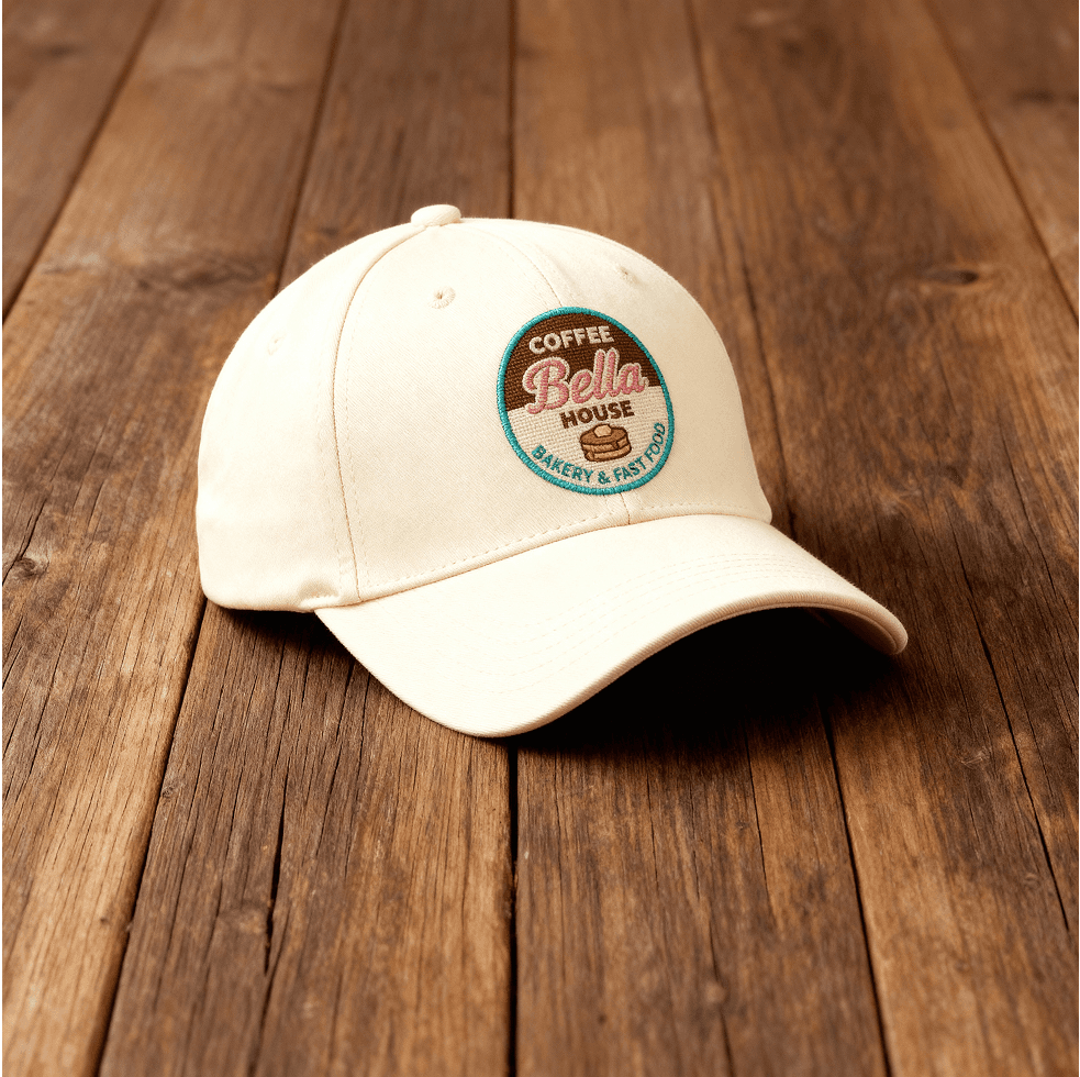
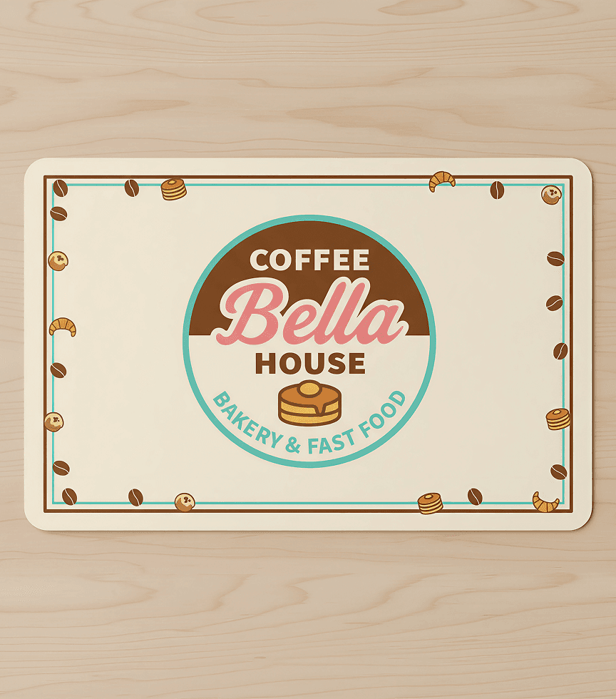


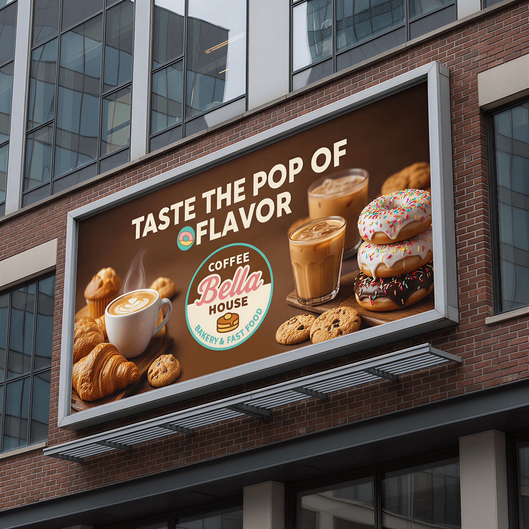
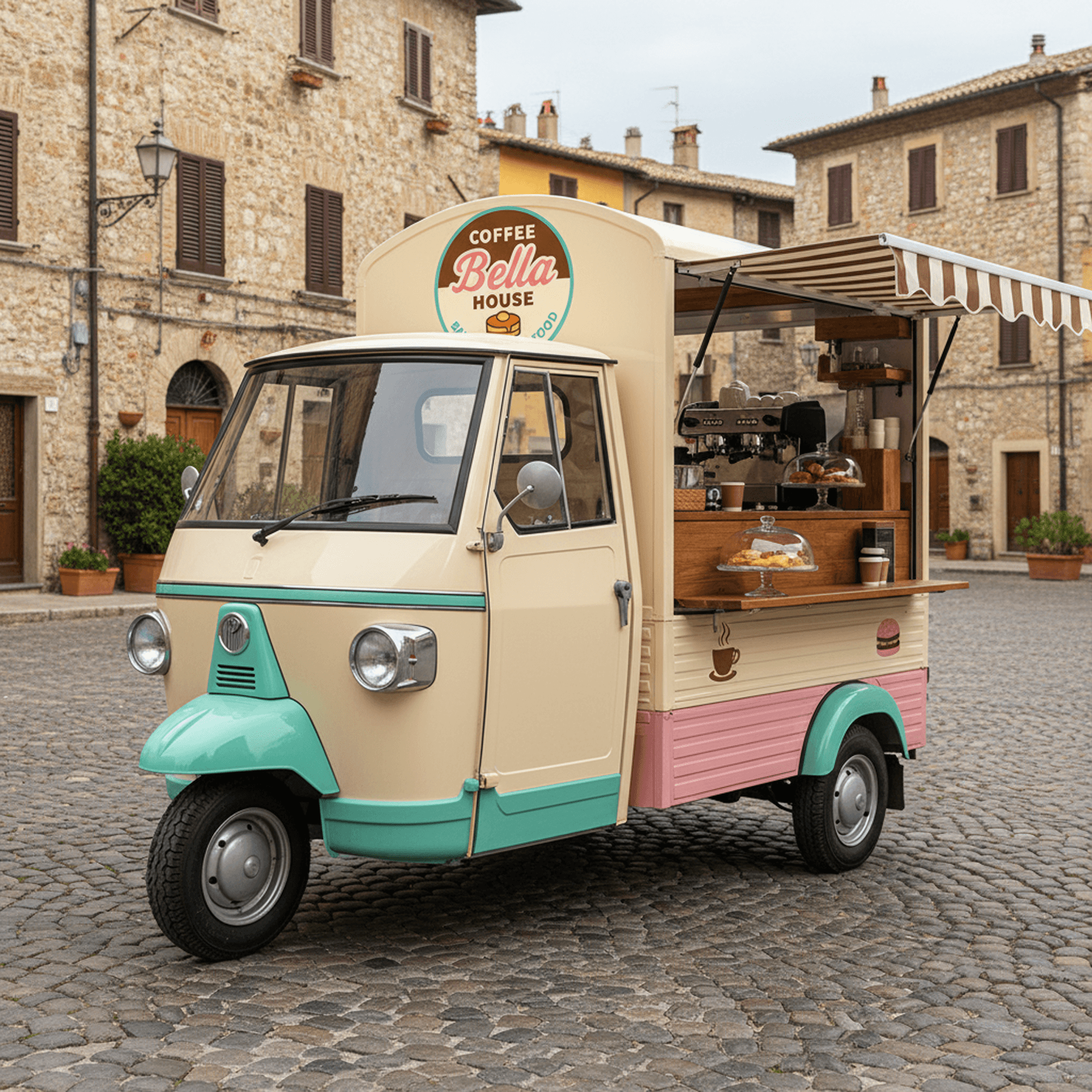
c_output
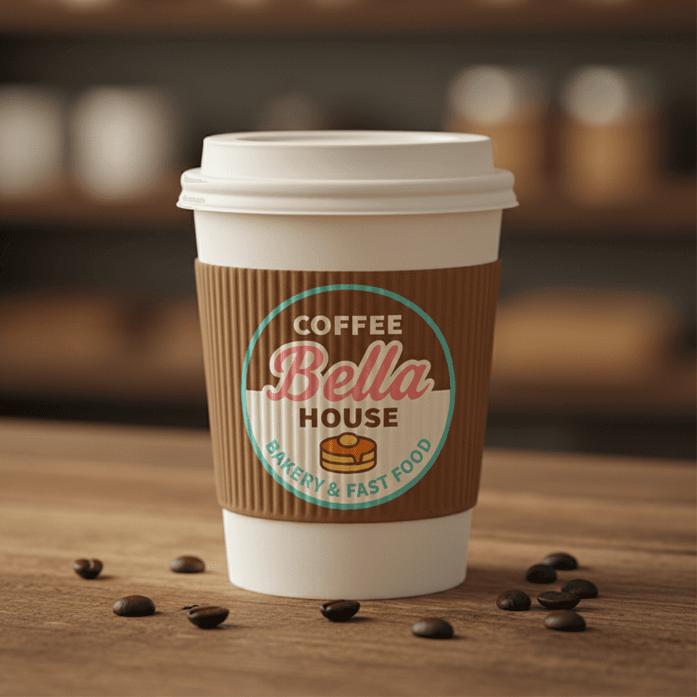
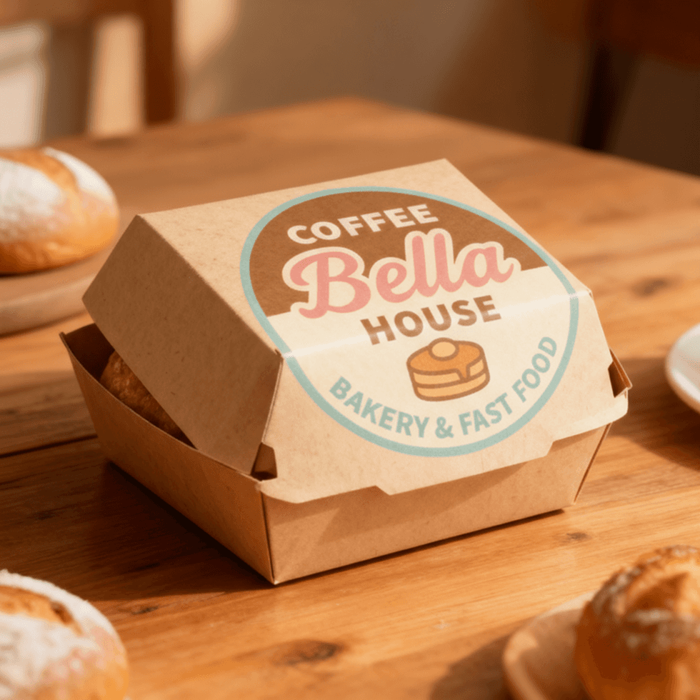
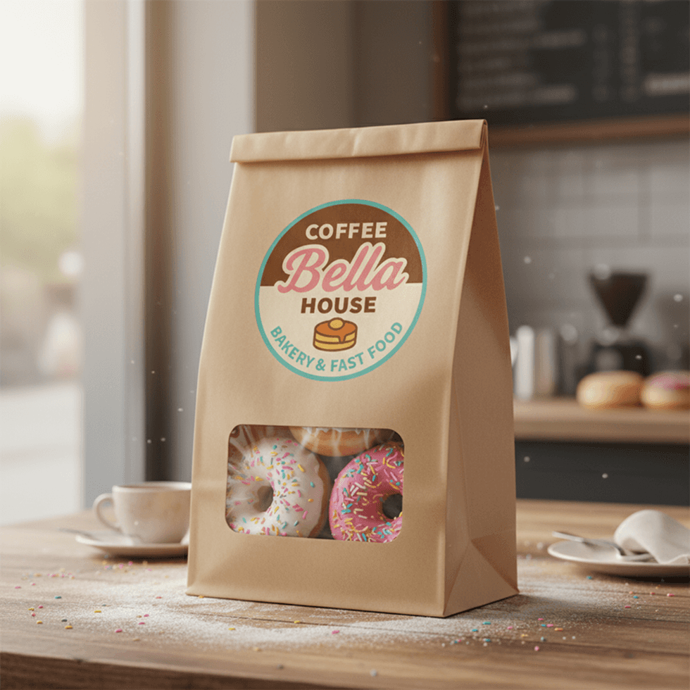
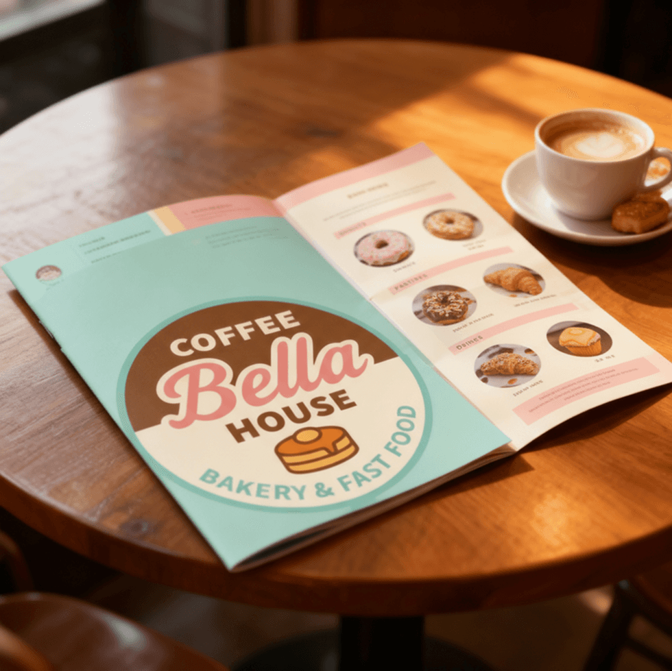
the identity feels handmade. a visual system that carries warmth and taste. from mark to matter - and to screen - design becomes environment.

©️ 2026 officina off topic | all rights reserved.